Mastering data visualisation: choosing the right graph for your data

December 7, 2023

In this blog, we will delve into the mathematical and practical aspects of selecting the most appropriate data visualisation method. We will offer insights on when and why you should use each one.

As a senior data analyst working in a tech mobility company, I have encountered various data types. I have found that the choice of the right graph, plot, or chart can significantly impact the way one perceives and interprets data.

Line charts for time series data

Time series data, which represents information collected over time, is prevalent in almost every industry.

The cab industry we track daily ride volumes, revenue over weeks, and driver hour trends. This makes line charts an excellent choice.

The reason is rooted in the fundamental concept of continuity. Line charts visually represent the data points as connected by lines, highlighting the sequence and trends within the data.

Mathematically, the line charts interpolate between data points, making them suitable for time-based data where intermediate values matter. The interpolation assumes a continuous change in values between points.

When creating a line chart for time series data, remember to ensure that the time intervals between data points are constant, making it suitable for mathematical operations such as differentiation or integration, which can be used for trend analysis or forecasting.

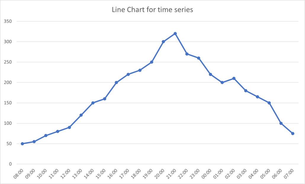
The line chart below illustrates a steady continuous growth to a peak, trailing off to a relatively similar position as at start. This could be an indication of patterns dependant on time of day.
Mastering data visualisation

Bar charts for categorical data

Categorical data, which consists of discrete categories or labels, plays a vital role in the cab industry when analysing customer feedback, driver ratings, or ride types.

Bar charts are the go-to-choice for visualising categorical data. They represent each category as a separate bar, with the height of the bar corresponding to the frequency or proportion of occurrences of that category.

Mathematically, bar charts use a discrete, non-continuous axis. This means that there is no interpolation between bars, making it the ideal choice for discrete categories.

Moreover, bar charts are versatile and can be displayed as either horizontal or vertical bars, depending on the preference.

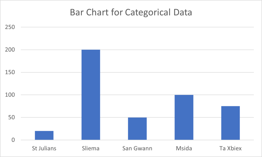
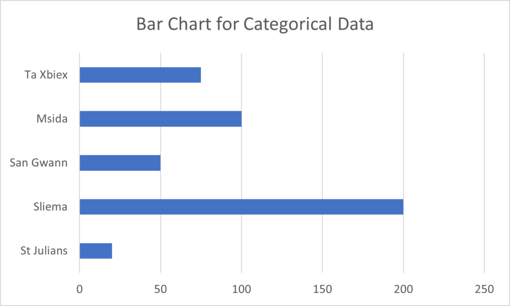
They allow for easy comparisons between categories and we can use them to illustrate trends or patterns in the data. The below bar charts make use of identical dummy data relating to the locations of pickups of users.

The horizontal and vertical bars are selected at the analyst’s discretion and depending on what is best to communicate the final results.
Pie charts for parts of a whole

When you need to visualise the composition of a whole dataset, pie charts are a valuable tool.

In the cab industry, you might use pie charts to show the percentage breakdown of revenue sources, expenses, or customer demographics.

Mathematically, pie charts represent a circle divided into slices, with each slice corresponding to a component’s portion of the whole. The angle of each slice is proportional to the component’s size relative to the whole.

Pie charts are particularly useful when you want to emphasize the part-to-whole relationship and provide a clear visual representation of proportions.

However, it’s important to use pie charts sparingly and ensure that the data is not too complex. As it can be challenging to compare multiple pie charts.

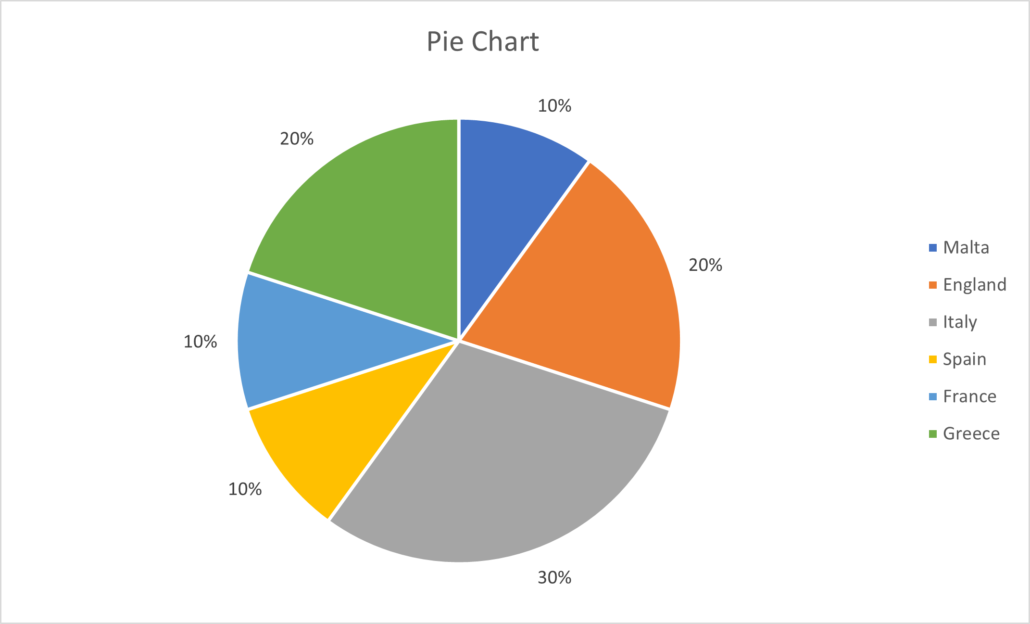
The pie chart found below illustrates the segmentation of users coming from which countries, determined by the mobile number prefix. This can be useful when trying to understand user demographics.
Mastering data visualisation

Scatter plots for correlation and relationships

In the cab industry, understanding the relationship between different variables is crucial. Scatter plots are a powerful way to visualise the correlation between two continuous variables.

This is especially useful when studying factors such as ride duration versus distance travelled or driver ratings versus ride frequency.

Mathematically, scatter plots display data points as individual dots on a two-dimensional plane, with one variable on the x-axis and the other on the y-axis.

By plotting data points this way, you can visually assess the presence and strength of any linear or non-linear relationships between the two variables.

Scatter plots also allow you to identify outliers and clusters of data points. This can be essential for anomaly detection or identifying specific patterns in your data.

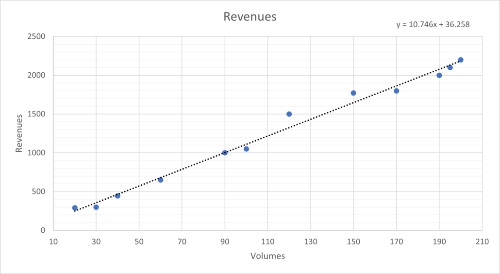
The scatter plot below illustrates the relationship between volumes and revenues. Here, we can see a clear linear relationship. We can easily extract an equation. And it can now be used to action changes in favour of company needs.
Mastering data visualisation

Histograms for data distribution

Understanding the distribution of data is crucial in the ride-hailing industry.

Histograms are a key tool for visualising the frequency distribution of a continuous variable, such as ride fares, customer ratings, or wait times.

Mathematically, histograms divide the range of a continuous variable into intervals or bins and represent the frequency or density of data points falling into each bin using bars.

The width and number of bins can be adjusted to fine-tune the level of detail in the visualisation.

Histograms help you identify the shape of the distribution, including whether it is normal (bell-shaped), skewed, or multimodal.

This information can be invaluable for making data-driven decisions and identifying areas for improvement.

Box plots for data distribution and outliers

Box plots, also known as box-and-whisker plots, provide a compact way to visualise the distribution of a dataset, as well as identify potential outliers and compare the distributions of different groups.

In the cab industry, we can use box plots to analyse driver earnings, customer wait times, or ride distances across different cities.

Mathematically, a box plot consists of a rectangular box and two whiskers. The box represents the interquartile range (IQR), with the median line inside. The whiskers extend to the minimum and maximum values within a certain range (typically, 1.5 times the IQR).

Box plots are ideal for displaying the spread, skewness, and presence of outliers in the data.

They allow for quick comparisons between different categories or groups, providing a concise summary of the data’s distribution.

Heatmaps for data density and correlation

Heatmaps are a versatile visualisation tool for displaying complex data relationships, data density, and correlations.

In the cab industry, you might use heatmaps to explore customer trip patterns, identify peak hours, or analyse geographical and geospatial distributions.

Mathematically, heatmaps represent data as a grid of coloured cells, with each cell’s colour intensity indicating the value or density. Heatmaps are particularly useful for visualising data over two dimensions, such as time and location.

Heatmaps can reveal trends, clusters, or hotspots in your data. This makes them a powerful tool for pattern recognition and identifying areas that require attention.

They are especially valuable when dealing with large datasets or multidimensional data.

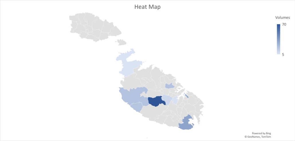
The heatmap below displays the density of volumes around our island, as part of a project that needed to determine optimal pathways using specific amounts of cabs.
Mastering data visualisation

Radar charts for multivariate data

When dealing with multivariate data in the cab industry, such as driver performance across various categories or customer satisfaction across different attributes, radar charts are a valuable choice.

Mathematically, radar charts represent each variable as an axis radiating from the centre. We connect data points to form a polygon. The shape of the polygon provides a visual summary of the values across multiple variables.

Radar charts are excellent for visualising the overall patterns and differences between entities (e.g. drivers, cities, or customer segments). They can reveal strengths and weaknesses in each entity’s performance in a clear and intuitive manner.

In conclusion, data visualisation and plots are invaluable tools for unlocking the hidden insights within vast datasets and conveying complex information in a comprehensible manner.

Whether you’re a data scientist, business analyst, or simply a curious individual looking to better understand the world around you, the power of visual storytelling cannot be overstated.

By choosing the right type of visualisation for your data, mastering the art of clarity and simplicity, and embracing the ever-evolving world of data visualisation technologies, you can harness the full potential of your data.

Happy visualising!

Mastering data visualisation

Mastering data visualisation: choosing the right graph for your data

In today’s data-driven world, data visualisation is a critical aspect of decision-making and understanding complex datasets.

In this blog, we will delve into the mathematical and practical aspects of selecting the most appropriate data visualisation method. We will offer insights on when and why you should use each one.

As a senior data analyst working in a tech mobility company, I have encountered various data types. I have found that the choice of the right graph, plot, or chart can significantly impact the way one perceives and interprets data.

Line charts for time series data

Time series data, which represents information collected over time, is prevalent in almost every industry.

The cab industry we track daily ride volumes, revenue over weeks, and driver hour trends. This makes line charts an excellent choice.

The reason is rooted in the fundamental concept of continuity. Line charts visually represent the data points as connected by lines, highlighting the sequence and trends within the data.

Mathematically, the line charts interpolate between data points, making them suitable for time-based data where intermediate values matter. The interpolation assumes a continuous change in values between points.

When creating a line chart for time series data, remember to ensure that the time intervals between data points are constant, making it suitable for mathematical operations such as differentiation or integration, which can be used for trend analysis or forecasting.

The line chart below illustrates a steady continuous growth to a peak, trailing off to a relatively similar position as at start. This could be an indication of patterns dependant on time of day.

Mastering data visualisation

Bar charts for categorical data

Categorical data, which consists of discrete categories or labels, plays a vital role in the cab industry when analysing customer feedback, driver ratings, or ride types.

Bar charts are the go-to-choice for visualising categorical data. They represent each category as a separate bar, with the height of the bar corresponding to the frequency or proportion of occurrences of that category.

Mathematically, bar charts use a discrete, non-continuous axis. This means that there is no interpolation between bars, making it the ideal choice for discrete categories.

Moreover, bar charts are versatile and can be displayed as either horizontal or vertical bars, depending on the preference.

They allow for easy comparisons between categories and we can use them to illustrate trends or patterns in the data. The below bar charts make use of identical dummy data relating to the locations of pickups of users.

The horizontal and vertical bars are selected at the analyst’s discretion and depending on what is best to communicate the final results.

Pie charts for parts of a whole

When you need to visualise the composition of a whole dataset, pie charts are a valuable tool.

In the cab industry, you might use pie charts to show the percentage breakdown of revenue sources, expenses, or customer demographics.

Mathematically, pie charts represent a circle divided into slices, with each slice corresponding to a component’s portion of the whole. The angle of each slice is proportional to the component’s size relative to the whole.

Pie charts are particularly useful when you want to emphasize the part-to-whole relationship and provide a clear visual representation of proportions.

However, it’s important to use pie charts sparingly and ensure that the data is not too complex. As it can be challenging to compare multiple pie charts.

The pie chart found below illustrates the segmentation of users coming from which countries, determined by the mobile number prefix. This can be useful when trying to understand user demographics.

Mastering data visualisation

Scatter plots for correlation and relationships

In the cab industry, understanding the relationship between different variables is crucial. Scatter plots are a powerful way to visualise the correlation between two continuous variables.

This is especially useful when studying factors such as ride duration versus distance travelled or driver ratings versus ride frequency.

Mathematically, scatter plots display data points as individual dots on a two-dimensional plane, with one variable on the x-axis and the other on the y-axis.

By plotting data points this way, you can visually assess the presence and strength of any linear or non-linear relationships between the two variables.

Scatter plots also allow you to identify outliers and clusters of data points. This can be essential for anomaly detection or identifying specific patterns in your data.

The scatter plot below illustrates the relationship between volumes and revenues. Here, we can see a clear linear relationship. We can easily extract an equation. And it can now be used to action changes in favour of company needs.

Mastering data visualisation

Histograms for data distribution

Understanding the distribution of data is crucial in the ride-hailing industry.

Histograms are a key tool for visualising the frequency distribution of a continuous variable, such as ride fares, customer ratings, or wait times.

Mathematically, histograms divide the range of a continuous variable into intervals or bins and represent the frequency or density of data points falling into each bin using bars.

The width and number of bins can be adjusted to fine-tune the level of detail in the visualisation.

Histograms help you identify the shape of the distribution, including whether it is normal (bell-shaped), skewed, or multimodal.

This information can be invaluable for making data-driven decisions and identifying areas for improvement.

Box plots for data distribution and outliers

Box plots, also known as box-and-whisker plots, provide a compact way to visualise the distribution of a dataset, as well as identify potential outliers and compare the distributions of different groups.

In the cab industry, we can use box plots to analyse driver earnings, customer wait times, or ride distances across different cities.

Mathematically, a box plot consists of a rectangular box and two whiskers. The box represents the interquartile range (IQR), with the median line inside. The whiskers extend to the minimum and maximum values within a certain range (typically, 1.5 times the IQR).

Box plots are ideal for displaying the spread, skewness, and presence of outliers in the data.

They allow for quick comparisons between different categories or groups, providing a concise summary of the data’s distribution.

Heatmaps for data density and correlation

Heatmaps are a versatile visualisation tool for displaying complex data relationships, data density, and correlations.

In the cab industry, you might use heatmaps to explore customer trip patterns, identify peak hours, or analyse geographical and geospatial distributions.

Mathematically, heatmaps represent data as a grid of coloured cells, with each cell’s colour intensity indicating the value or density. Heatmaps are particularly useful for visualising data over two dimensions, such as time and location.

Heatmaps can reveal trends, clusters, or hotspots in your data. This makes them a powerful tool for pattern recognition and identifying areas that require attention.

They are especially valuable when dealing with large datasets or multidimensional data.

The heatmap below displays the density of volumes around our island, as part of a project that needed to determine optimal pathways using specific amounts of cabs.

Mastering data visualisation

Radar charts for multivariate data

When dealing with multivariate data in the cab industry, such as driver performance across various categories or customer satisfaction across different attributes, radar charts are a valuable choice.

Mathematically, radar charts represent each variable as an axis radiating from the centre. We connect data points to form a polygon. The shape of the polygon provides a visual summary of the values across multiple variables.

Radar charts are excellent for visualising the overall patterns and differences between entities (e.g. drivers, cities, or customer segments). They can reveal strengths and weaknesses in each entity’s performance in a clear and intuitive manner.

In conclusion, data visualisation and plots are invaluable tools for unlocking the hidden insights within vast datasets and conveying complex information in a comprehensible manner.

Whether you’re a data scientist, business analyst, or simply a curious individual looking to better understand the world around you, the power of visual storytelling cannot be overstated.

By choosing the right type of visualisation for your data, mastering the art of clarity and simplicity, and embracing the ever-evolving world of data visualisation technologies, you can harness the full potential of your data.

Happy visualising!

Mastering data visualisation