Do you want to know more about the cutting-edge technology behind eCabs’ innovative solutions? Follow our Tech blog, where our expert team dives deep into the fascinating world of technology and mobility.

Using machine learning for time series prediction and forecasting

Using machine learning for time series forecasting with SARIMAX in Python

In this blog post, we’ll explore how to make use of SARIMAX, a powerful statistical method, in conjunction with machine learning techniques for time series forecasting using Python within the mobility industry.

With the introduction of machine learning, traditional statistical methods have been enhanced to deliver more accurate and robust predictions.

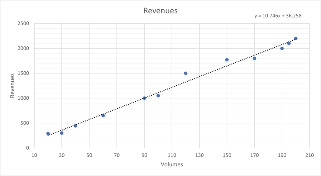
In ride-hailing, predicting customer volumes is essential for optimising operations, managing resources efficiently, and enhancing customer experience. This can be achieved with time series forecasting techniques like SARIMAX.

Time series forecasting techniques like SARIMAX can play a crucial role in this regard.

We will demonstrate how we can apply SARIMAX to predict customer volumes in the mobility sector.

What is SARIMAX?

Seasonal Autoregressive Integrated Moving Average with Exogenous Regressors (SARIMAX) is a statistical method commonly used for time series analysis and forecasting. 

It extends the ARIMA model by incorporating additional parameters for seasonal variations and exogenous variables.

SARIMAX models are widely used in industries such as finance, economics, and healthcare for predicting future values based on historical data patterns.

We also use it within the mobility industry.

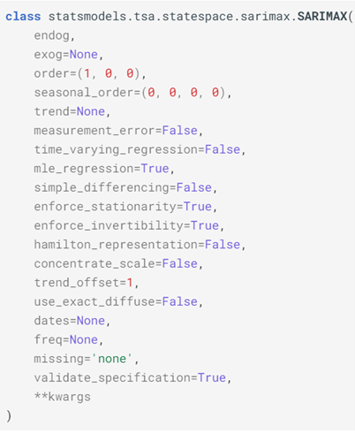
As can be seen in the below snapshot of possible inputs for this statistical method, the Python package has a diverse number of possible variables that the analyst can use to personalise the tool with.

The ones most typically amended with company-specific values are ‘order’ and ‘seasonal order’ and rest are commonly left with their default values as described here

Leveraging machine learning for time series prediction and forecasting 2

Mathematical Formulation

Leveraging machine learning for time series prediction and forecasting 2

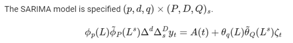
For the mathematically minded, this is how the method is defined using three sets of parameters. 

The three sets of parameters:

  • Seasonal Parameters (p, d, q, P, D, Q, s):
    • p: Autoregressive order for the seasonal component.
    • d: Degree of differencing for the seasonal component.
    • q: Moving average order for the seasonal component.
    • P: Seasonal autoregressive order.
    • D: Degree of differencing for the seasonal component.
    • Q: Seasonal moving average order.
    • s: Seasonal period (e.g., 24 for hourly data, 7 for weekly data, 12 for monthly data and 4 for quarterly data)
  • Non-seasonal Parameters (p, d, q):
    • p: Autoregressive order for the non-seasonal component.
    • d: Degree of differencing for the non-seasonal component.
    • q: Moving average order for the non-seasonal component.
  • Exogenous Variables (X):
    • Additional variables that are incorporated into the model to capture their influence on the time series.

In ‘English’

  • The Seasonal Component in SARIMAX accounts for seasonal patterns in the time series data. Seasonality refers to repeating patterns that occur at regular intervals, such as daily, weekly, or yearly cycles. By incorporating seasonal parameters, SARIMAX can capture and model these patterns effectively.
  • The Autoregressive (AR) Component of The autoregressive component of SARIMAX models the relationship between an observation and a number of lagged observations (i.e., past values of the time series). This component captures the dependence of the current value on its previous values.
  • The Integrated (I) Component: The integrated component of SARIMAX accounts for non-stationarity in the time series data by differencing. Non-stationarity refers to the presence of trends or irregular patterns that change over time. By differencing the data, SARIMAX transforms it into a stationary series, making it suitable for modelling.
  • The Moving Average (MA) Component: The moving average component of SARIMAX models the dependency between an observation and a residual error from a moving average model applied to lagged observations. This component helps capture short-term fluctuations and noise in the data.
  • The Exogenous Variables (X) in SARIMAX allows for the inclusion of exogenous variables, which are external factors that may influence the time series but are not part of the time series itself. These variables could be economic indicators, weather conditions, or any other relevant factors that affect the phenomenon being studied.

Workflow of SARIMAX Modelling

  1. Data Collection and Preparation:

One must first gather historical data on customer volumes from the company’s database or other such relevant sources. This data could include metrics such as the number of ride requests or bookings per hour/day. This data must then be pre-processed by handling missing values, removing outliers, and converting timestamps to appropriate datetime objects. 

  • Exploratory Data Analysis (EDA):

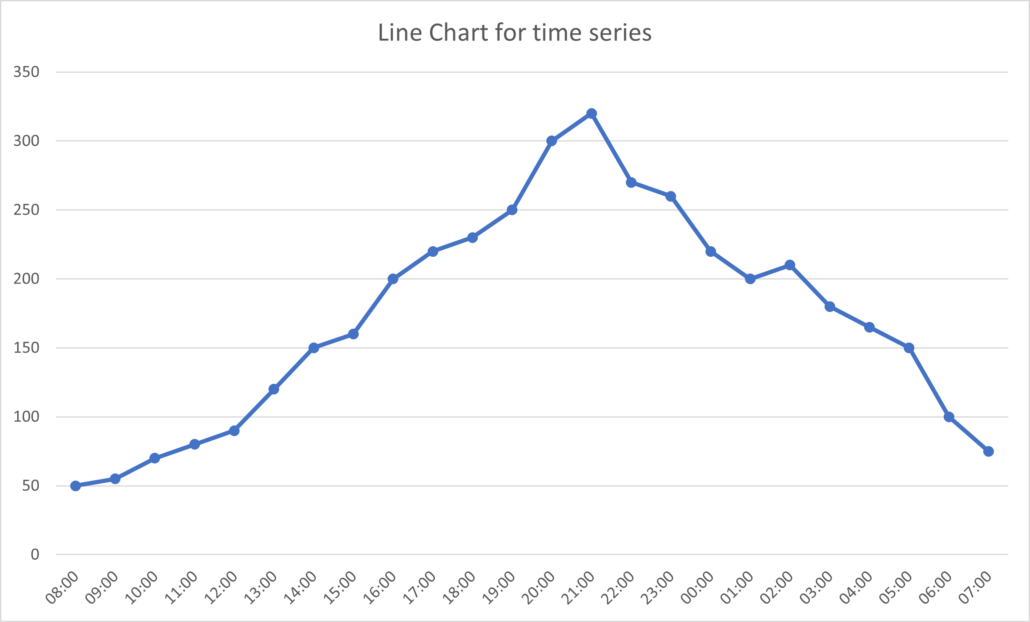
One must then conduct exploratory data analysis to understand any underlying patterns or trends in customer volumes. The time series data is then visualised using line plots, histograms, and seasonal decomposition to identify seasonality, trends, and any anomalies which are to be used in the next stage.

  • Model Building:

The Machine Learning (ML) portion of the process starts here by splitting the dataset into training and testing sets, ensuring that the temporal order is maintained. A SARIMAX model is fit to the training data, specifying the appropriate parameters such as order and seasonal order based on the identified patterns in the data in the previous step. One may also include exogenous variables such as weather conditions, holidays, or events that may influence customer volumes at this stage.

  • Model Evaluation:

The performance of the SARIMAX model is then evaluated using metrics such as Mean Absolute Error (MAE), Mean Squared Error (MSE), and Root Mean Squared Error (RMSE) on the testing set. The forecasted customer volumes are compared with the actual values to assess the accuracy of the model.

  • Forecasting:

The trained SARIMAX model is then used to generate forecasts for future time periods, capturing variations in customer volumes. The forecasted customer volumes are visualised along with prediction intervals to provide insights into the uncertainty associated with the predictions.

Conclusion

Predicting important metrics as accurately as possible is vital for making data-driven decisions within businesses, particularly those within the mobility industry as it allows for the optimisation of operations and customer experience.

By making the most of the tools at hand, particularly packages like SARIMAX in Python for time series forecasting, ride-hailing companies such as eCabs can try to anticipate fluctuations in demand and supply within such a volatile market.

Julia Vella
A passion for research and continuous development

A passion for research and continuous development

eCabs Technologies Product Owner Stephanie Farrugia gives an insider’s perspective on how she and her team navigate the ever-changing landscape of the mobility sector and how her pivotal role allows her to indulge on her love of continuous development and research.

Can you provide an overview of your role as a Product Owner at eCabs Technologies?

My role within eCabs Technologies is quite dynamic. I am the Product Owner of Data, which is a crucial business enabler, as it empowers key stakeholders to take timely and informed decisions from both a strategic and operational viewpoint. 

To achieve all this, the primary responsibilities include that of making sure that the underlying data infrastructure is operating smoothly. As well as performing ongoing prioritisation of incoming data requests by validating the respective business impact. 

In my role, I also need to provide support to all my fellow Product Owners in providing the necessary data analytics as a pre-requisite to designing new features.   

As a Product Owner, and together with the team when specific data reporting requirements pose a technical challenge, we make sure that we investigate and seek the right technical approach to deliver the expected level of visibility. 

During the first part of my exciting journey with eCabs I worked on the Customer App mainly in identifying and analysing new features that would facilitate the customer journey.

Supported by our UI/UX team, we facilitated the pickup process, making it easier for customers to select pickup points within busy areas and on special events, amongst many other innovations. 

It is most satisfying to make use of the same features as a customer eventually, which I definitely did! 

How does eCabs prioritise which new features or products to work on, and what role do you play in shaping these decisions?

As a Product team we are responsible for devising the roadmap of all our products.

We base the order of priority for developing listed features on the scale of impact a feature would have on its stakeholders, supported by market research and data analytics, since we want to deliver the features and products that matter most.

We also consider the cost and effort involved in developing any given new feature compared to its business value.

eCabs and Google, with the support of TIM Italia and Noovle Malta Ltd, recently partnered up to exploit the use of machine learning and ways how through this technical concept eCabs would be able to provide a unique personal experience to our esteemed customers. 

This would be achievable through the application of algorithms on both historical and real time data that would predict customer preferences based on identified behavioural patterns and external dynamics that affect these patterns.

We also take pride in being among the first global ride-hailing platforms to leverage the distinctive capabilities of the Google Maps Mobility Platform. By harnessing real-time data, we ensure precise dispatch, accurate estimated time of arrivals (ETAs), hyper-intelligent route optimisation, and dynamic pricing. This approach not only facilitates expedited rides but also enhances cost efficiency for the benefit of our valued passengers and drivers alike.

Could you tell us about your interactions with other eCabs Technologies teams?

This is one of the most rewarding aspects of our role in that we first devise an idea and translate it into a Product Requirement Document inclusive of a detailed analysis as how we plan to fulfill the given requirement.

Once reviewed by the respective Product Owner within the team, we initiate a chain of communication with other teams starting from the Solution Architect going on to the developers when we start discussing our product from a technical viewpoint, possibly discussing specific recommended adaptations.

Eventually once the product is developed, our Quality Assurance (QA) team would be involved to ensure the product has been delivered as based on the ‘Behaviour-Driven-Development’ (BDD) scenarios that we would have documented previously which describes the expected behaviour based on a given action. 

Once QA completes their testing, the product is ready to be released and all the work comes into fruition!

What challenges have you encountered while working on product development at eCabs, and how did you and your team overcome them?

Prioritisation is always a tricky game as the mobility sector is a fast-paced industry. Being ahead of the curve is the only way to remain ahead of competition and setting the trends rather than following them. 

As a Product team we remain sensitive to market developments and by following the prioritisation criteria previously explained, we do adapt our product roadmap when this is evidently required.

eCabs Technologies operates in various markets. Can you share some insights into how you adapt your product strategy to suit different geographic regions or customer preferences?

Investing in localisation tools, starting from language translation, is key while researching on specific regulatory compliance requirements relevant to targeted regions is crucial. 

We… take pride in being among the first global ride-hailing platforms to leverage the distinctive capabilities of the Google Maps Mobility Platform.

eCabs Technologies Product Owner Stephanie Farrugia

Our vision underlying our product strategy is to ensure ease of adaptability in offering a dynamic platform aimed to empower our prospective tenants to let them decide on the deployment or not of certain features including the support for different pricing strategies suiting different market landscapes.

Our operational strategy is focused on speeding up and fine tuning the process to bring changes and country specific product requirements to market quickly.

Can you highlight any memorable success stories or milestones from your time as a Product Owner?

As a Product Owner and ably delivered by the data team and well mentored by the key stakeholders, we devised a reporting dashboard that leverages our 14 years of operational experience to support both our current and prospective tenants. 

This way, once onboarded, they immediately gain visibility on their operational performance in almost real time.  

Ongoing competition and market analysis while subscribing to relevant technical resources is key to keeping up with the momentum of this fast-moving industry.

Knowledge sharing across teams is also extremely helpful, which is a concept well encouraged and facilitated by the company.

What excites you about eCabs Technologies’ future in the mobility industry?

The seamless integration of cutting-edge technologies from industry leaders such as Google Cloud empowers our platform to not only navigate and capitalise on prevailing market opportunities but also ensures our readiness for the challenges and innovations that tomorrow may bring, such as autonomous vehicles, for instance.

The fact that there are increasing pressures for sustainability and environmental policies to be in place means that I perceive the mobility industry to play a key role in supporting this crucial mind shift supported by serious commitment from all stakeholders.

Stephanie Farrugia A passion for research and continuous development
Driving digital transformation with Google Cloud

Driving digital transformation with Google Cloud

eCabs worked with Google Cloud and TIM Enterprise to achieve its vision, positioning the platform as an always-on option, contributing positively not only to eCabs but also to its customers and end-users.

The emergence of smartphone apps has reshaped the ride-hailing industry, presenting both challenges and opportunities for established players.

eCabs has successfully navigated this digital transformation, combining decades of experience with cutting-edge technology.

The tech mobility company has created its own robust customisable platform, which is designed not only designed not only for its own operation, but also paves the way for the digital evolution of legacy cab companies across Europe, and is tailored to meet the diverse needs of operators worldwide.

As the company continued its digital transformation journey, migrating to Google Cloud was a natural progression, enabling flexibility, scalability, and enhanced reliability.

A strategic partnership

In the intricate process of migration, eCabs found a valuable ally in TIM Enterprise, a Google Cloud partner.

The partnership facilitated a seamless transition from bare metal to GKE architecture, unlocking additional solutions such as BigQuery.

With TIM Enterprise’s guidance, eCabs maximises BigQuery for comprehensive data analytics. This offers valuable insights to customers for planning and performance reviews.

Leveraging Google Kubernetes Engine (GKE), eCabs powers its microservices architecture, providing unique environments for international tenants. This move allows quick replication of environments, enabling eCabs to rapidly onboard new customers and showcase the value of its platform.

Google Cloud and TIM Enterprise play a pivotal role in enabling eCabs to seize current market opportunities and prepare for the future.

As eCabs continues its international expansion, by utilising Google Cloud tools, eCabs empowers legacy cab companies and new entrants, allowing them to compete with digital ride-hailing giants.

Explore eCabs’ success story on the Google Cloud blog.

Mastering data visualisation choosing the right graph for your data

Mastering data visualisation: choosing the right graph for your data

In this blog, we will delve into the mathematical and practical aspects of selecting the most appropriate data visualisation method. We will offer insights on when and why you should use each one.

As a senior data analyst working in a tech mobility company, I have encountered various data types. I have found that the choice of the right graph, plot, or chart can significantly impact the way one perceives and interprets data.

Line charts for time series data

Time series data, which represents information collected over time, is prevalent in almost every industry.

The cab industry we track daily ride volumes, revenue over weeks, and driver hour trends. This makes line charts an excellent choice.

The reason is rooted in the fundamental concept of continuity. Line charts visually represent the data points as connected by lines, highlighting the sequence and trends within the data.

Mathematically, the line charts interpolate between data points, making them suitable for time-based data where intermediate values matter. The interpolation assumes a continuous change in values between points.

When creating a line chart for time series data, remember to ensure that the time intervals between data points are constant, making it suitable for mathematical operations such as differentiation or integration, which can be used for trend analysis or forecasting.

The line chart below illustrates a steady continuous growth to a peak, trailing off to a relatively similar position as at start. This could be an indication of patterns dependant on time of day.

Mastering data visualisation

Bar charts for categorical data

Categorical data, which consists of discrete categories or labels, plays a vital role in the cab industry when analysing customer feedback, driver ratings, or ride types.

Bar charts are the go-to-choice for visualising categorical data. They represent each category as a separate bar, with the height of the bar corresponding to the frequency or proportion of occurrences of that category.

Mathematically, bar charts use a discrete, non-continuous axis. This means that there is no interpolation between bars, making it the ideal choice for discrete categories.

Moreover, bar charts are versatile and can be displayed as either horizontal or vertical bars, depending on the preference.

They allow for easy comparisons between categories and we can use them to illustrate trends or patterns in the data. The below bar charts make use of identical dummy data relating to the locations of pickups of users.

The horizontal and vertical bars are selected at the analyst’s discretion and depending on what is best to communicate the final results.

Pie charts for parts of a whole

When you need to visualise the composition of a whole dataset, pie charts are a valuable tool.

In the cab industry, you might use pie charts to show the percentage breakdown of revenue sources, expenses, or customer demographics.

Mathematically, pie charts represent a circle divided into slices, with each slice corresponding to a component’s portion of the whole. The angle of each slice is proportional to the component’s size relative to the whole.

Pie charts are particularly useful when you want to emphasize the part-to-whole relationship and provide a clear visual representation of proportions.

However, it’s important to use pie charts sparingly and ensure that the data is not too complex. As it can be challenging to compare multiple pie charts.

The pie chart found below illustrates the segmentation of users coming from which countries, determined by the mobile number prefix. This can be useful when trying to understand user demographics.

Mastering data visualisation

Scatter plots for correlation and relationships

In the cab industry, understanding the relationship between different variables is crucial. Scatter plots are a powerful way to visualise the correlation between two continuous variables.

This is especially useful when studying factors such as ride duration versus distance travelled or driver ratings versus ride frequency.

Mathematically, scatter plots display data points as individual dots on a two-dimensional plane, with one variable on the x-axis and the other on the y-axis.

By plotting data points this way, you can visually assess the presence and strength of any linear or non-linear relationships between the two variables.

Scatter plots also allow you to identify outliers and clusters of data points. This can be essential for anomaly detection or identifying specific patterns in your data.

The scatter plot below illustrates the relationship between volumes and revenues. Here, we can see a clear linear relationship. We can easily extract an equation. And it can now be used to action changes in favour of company needs.

Mastering data visualisation

Histograms for data distribution

Understanding the distribution of data is crucial in the ride-hailing industry.

Histograms are a key tool for visualising the frequency distribution of a continuous variable, such as ride fares, customer ratings, or wait times.

Mathematically, histograms divide the range of a continuous variable into intervals or bins and represent the frequency or density of data points falling into each bin using bars.

The width and number of bins can be adjusted to fine-tune the level of detail in the visualisation.

Histograms help you identify the shape of the distribution, including whether it is normal (bell-shaped), skewed, or multimodal.

This information can be invaluable for making data-driven decisions and identifying areas for improvement.

Box plots for data distribution and outliers

Box plots, also known as box-and-whisker plots, provide a compact way to visualise the distribution of a dataset, as well as identify potential outliers and compare the distributions of different groups.

In the cab industry, we can use box plots to analyse driver earnings, customer wait times, or ride distances across different cities.

Mathematically, a box plot consists of a rectangular box and two whiskers. The box represents the interquartile range (IQR), with the median line inside. The whiskers extend to the minimum and maximum values within a certain range (typically, 1.5 times the IQR).

Box plots are ideal for displaying the spread, skewness, and presence of outliers in the data.

They allow for quick comparisons between different categories or groups, providing a concise summary of the data’s distribution.

Heatmaps for data density and correlation

Heatmaps are a versatile visualisation tool for displaying complex data relationships, data density, and correlations.

In the cab industry, you might use heatmaps to explore customer trip patterns, identify peak hours, or analyse geographical and geospatial distributions.

Mathematically, heatmaps represent data as a grid of coloured cells, with each cell’s colour intensity indicating the value or density. Heatmaps are particularly useful for visualising data over two dimensions, such as time and location.

Heatmaps can reveal trends, clusters, or hotspots in your data. This makes them a powerful tool for pattern recognition and identifying areas that require attention.

They are especially valuable when dealing with large datasets or multidimensional data.

The heatmap below displays the density of volumes around our island, as part of a project that needed to determine optimal pathways using specific amounts of cabs.

Mastering data visualisation

Radar charts for multivariate data

When dealing with multivariate data in the cab industry, such as driver performance across various categories or customer satisfaction across different attributes, radar charts are a valuable choice.

Mathematically, radar charts represent each variable as an axis radiating from the centre. We connect data points to form a polygon. The shape of the polygon provides a visual summary of the values across multiple variables.

Radar charts are excellent for visualising the overall patterns and differences between entities (e.g. drivers, cities, or customer segments). They can reveal strengths and weaknesses in each entity’s performance in a clear and intuitive manner.

In conclusion, data visualisation and plots are invaluable tools for unlocking the hidden insights within vast datasets and conveying complex information in a comprehensible manner.

Whether you’re a data scientist, business analyst, or simply a curious individual looking to better understand the world around you, the power of visual storytelling cannot be overstated.

By choosing the right type of visualisation for your data, mastering the art of clarity and simplicity, and embracing the ever-evolving world of data visualisation technologies, you can harness the full potential of your data.

Happy visualising!

Mastering data visualisation
Behind the code innovative minds, seamless rides

Behind the code: innovative minds, seamless rides

Explore the story, challenges, and solutions ‘behind the code’ with eCabs Technologies’ Backend Team Lead.

What are the main responsibilities of a backend developer in your team?

Working in backend development at eCabs, I focus on designing, developing, and maintaining our server-side logic and databases. I write clean, efficient, and reusable code to ensure seamless platform operation.

My day-to-day involves collaboration, code reviews, mentoring, and optimising for performance, scalability, and security. I also troubleshoot and stay updated with industry trends to implement cutting-edge solutions.

How does your team’s work contribute to fulfilling eCabs’ mission and improving transportation services?

My team’s work is pivotal in fulfilling eCabs’ mission. We focus on backend infrastructure, ensuring it’s robust and aligned with company goals.

By delivering high-quality, scalable solutions, we provide a seamless user experience, revolutionising transportation services. Our emphasis on code quality and performance optimisation positions us for long-term success and growth.

Can you share a specific project that you are proud of, and what challenges you faced during its implementation?

One project that I’m particularly proud of is our multi-tenancy transition. Initially, our operations were exclusive to Malta, but this project marked a significant leap in our expansion strategy.

It allowed us to extend our technology into both Greece and Romania, opening up numerous exciting possibilities for the future.

However, this transition came with its fair share of challenges. Adapting our platform for multi-tenancy required a meticulous approach.

We needed to ensure that each city partner could seamlessly and securely access their data and services while maintaining optimal performance and reliability across all regions.

What strategies and actions did you take to tackle these challenges?

To tackle these challenges, we conducted a comprehensive analysis of our existing infrastructure.

This informed our strategy for implementing multi-tenancy, which involved an almost complete redesign of our backend architecture, optimisation of database schemas, and the establishment of robust access control mechanisms.

Additionally, we put in place rigorous testing protocols to validate the scalability and security of the system.

The successful execution of this transition not only expanded our operational reach but also positioned us for further growth and expansion into new markets.

It stands as a testament to the dedication and expertise of our team in overcoming complex challenges and achieving strategic objectives.

Can you describe the technologies and tools you use in your tech stack for backend development?

As a backend developer, the arsenal of technologies at my disposal is diverse and tailored to meet the specific needs of our platform. Our tech stack is finely tuned to ensure the efficiency, scalability, and robustness of our services.

For legacy services, Java 8 remains an essential component of our toolset, allowing us to maintain stability and support for existing systems. For newer services, we adopted Java 17, leveraging its cutting-edge features to build innovative solutions that align with industry best practices.

How do you ensure scalability in your tech mobility platform, and what role do cloud-native architecture and microservices play in this?

Frameworks play a pivotal role in our development process. Spring Boot is a cornerstone, enabling rapid application development and seamless integration with various components.

Additionally, we’ve embraced Quarkus, harnessing its lightweight and reactive architecture to further enhance the performance of our applications.

In terms of databases, we rely on Postgres for its reliability and robust feature set. For more specialised data requirements, we have integrated MongoDB, offering flexibility and scalability for specific use cases.

As for message queuing and communication, we utilise RabbitMQ to facilitate asynchronous communication between different parts of our system. We also leverage pubsub mechanisms to ensure real-time updates and notifications.

Containerisation and orchestration are fundamental to our deployment strategy. Kubernetes forms the backbone of our container orchestration, providing a scalable and resilient environment for our services.

This, in conjunction with our cloud infrastructure, is hosted on Google Cloud Platform (GCP), ensuring a secure and performant environment for our applications.

In essence, our tech stack is a carefully curated blend of proven technologies and innovative solutions. It allows us to deliver a high-performance platform while maintaining the flexibility to adapt to evolving industry standards and user demands.

How do cloud-native architecture and microservices contribute to this scalability?

Scalability is central to our tech mobility platform. We adopt cloud-native architecture and microservices, allowing us to independently scale components based on demand.

Auto-scaling and horizontal scaling ensure seamless handling of increased user activity. Rigorous testing and load balancing fine-tune performance. Our team continuously explores emerging tech to enhance scalability.

Our development process thrives on effective collaboration. Working closely with product managers, designers, frontend developers and mobile developers, I ensure a clear understanding of project goals. Continuous communication, including stand-up meetings and design reviews, keeps us aligned.

With frontend and mobile developers, we establish seamless integration and troubleshoot together. Knowledge-sharing and cross-training further enhance our collective expertise, leading to high-quality solutions.

Continuous learning is fundamental in software development. Staying updated with emerging technologies is imperative.

In the dynamic field of software development, complacency is not an option. Keeping pace with emerging technologies is crucial.

Recent breakthroughs such as serverless architectures and widespread Kubernetes adoption have reshaped how we develop and deploy. This adaptability ensures our solutions remain cutting-edge.

Our development process thrives on effective collaboration. Working closely with product managers, designers, frontend developers and mobile developers, I ensure a clear understanding of project goals.

eCabs Technologies Backend Team Lead Burak Aykan Ürer

Embracing microservices empowers rapid response to changing demands. A steadfast focus on observability and stringent security safeguards system reliability and data integrity.

The commitment to continuous learning not only enhances our capabilities but also leads to innovative and effective software solutions.

In the fast-paced, competitive market of ride-hailing, sustaining innovation and agility is pivotal. We actively seek customer feedback and foster a culture of experimentation.

Agile methodologies empower us to swiftly adapt to changing needs. Additionally, we keep a vigilant eye on industry trends and invest in ongoing learning.

This comprehensive approach ensures we stay at the forefront of development, remaining both competitive and responsive to our customer base.

What advice would you offer to aspiring backend developers entering the tech mobility industry

I would advise aspiring backend developers looking to enter the tech mobility industry to focus on a few key areas.

Firstly, mastering core backend technologies is crucial. This forms the foundation of your technical prowess.

Additionally, familiarise yourself with cloud platforms like AWS or Google Cloud, as they’re integral for creating scalable and reliable infrastructure.

Understanding microservices architecture is equally important, as it allows for flexibility and scalability in complex systems.

APIs are a cornerstone in mobility services, so becoming proficient in designing and working with them is essential.

Given the sensitive nature of user data, prioritising knowledge of data security, encryption, and privacy regulations is paramount.

Lastly, remember that continuous learning is non-negotiable. The tech industry is ever evolving, so staying curious and open to adopting new tools and frameworks is imperative.

This combination of technical proficiency, problem-solving abilities, and a passion for learning will undoubtedly pave the way for success in the tech mobility industry.

Burak Aykan Ürer
Sticking to what works in ride-hailing apps

Sticking to what works in ride-hailing apps

What places eCabs Technologies’ App amongst the best ride-hailing apps in the world today?

Modern-day applications are user-centric. We are no exception to the rule.

Instead of reinventing the wheel, we’ve applied our extensive learnings and experience to ensure a standardised seamless in-app experience.

The landscape of digital interfaces is constantly evolving. Yet there is something to be said for adhering to what users are familiar with. Especially in the fast-paced world of ride-hailing apps.

In our pursuit to design the optimal user experience, we’ve settled on a few key principles that drive our decision-making.

Sticking to what works in ride-hailing apps

Seamless and intuitive experience

We prioritise a seamless UX/UI that reduces friction for users. Instead of trying to be overly innovative, we believe in building upon what users are already accustomed to in ride-hailing application layouts. This approach ensures an intuitive and natural experience for our end user. This ensures that customers can easily adopt the eCabs app wherever our technology is deployed without encountering any steep learning curves.  

Consistent movement and action

Just as you would expect a book to open from the side rather than the top, or a door to swing, app functionalities should follow familiar patterns. At eCabs Technologies, we respect the ‘mental muscle memory’ users develop over time. Replicating existing movements means users won’t be caught off guard or feel the need to learn a new way to navigate an app. This also contributes to reducing drop-offs and increasing conversions.

Reduced cognitive load

Every second counts when you are trying to book a ride. By reducing the thinking time and effort required to use our app, we’re ensuring that you can book a cab swiftly and without hassle. Additionally, this ensures that your end customers reduce ‘toggling’, between other ride-hailing platforms. When users intuitively know what to do next, they stage engaged.

Sticking to what works in ride-hailing apps

In essence, our design philosophy is to make the eCabs experience so smooth and effortless that it becomes the go-to choice when you need to book a cab, every single time.

Are we right?

Download our app and let us know.

Kristen Jim Albuquerque
Using machine learning for cost optimisation

Using machine learning for cost optimisation

As a marketing data analyst working in the tech mobility industry, I mainly work on tasks centred around the needs and requirements of the Marketing Department.

But I also get to collaborate with different teams and work on projects that need my technical and scientific expertise.

I was recently approached by eCabs International Business Development Manager Ruslan Golomovzy as part of a large-scale project.

The task: to plan a permanent mobility solution for transporting hundreds of people to various destinations from an initial central location. And then back to their original destinations.

The goal: to assist the client in a cost-cutting exercise, reducing travel time (by 50%) to ensure employee satisfaction.  

It was a tall order that presented a unique set of challenges. Just the sort of thing I like to sink my teeth into.

We couldn’t simply provide an infinite number of rides for the users. Since that would strain the budget resources and interfere with restrictions set by our client.

So, what could we do instead? Eventually the discussion turned to machine learning.

Using the predictive model which I created, I was able to approximate the volumes of users during the project’s time window. You can find an explanation of this predictive model in my previous blog post.

I therefore had a rough estimate of how many cabs we could use for this project. I will denote this number of available (and maximum) cabs as the letter K.

K-means clustering algorithm

At an initial glance, it seems like a relatively easy exercise, right? Clustering locations that are within a certain radial distance and providing transportation that suffices to hold each cluster.

Optimising the number of vehicles ensures minimal resource cost and maximum customer experience.

On a small scale, this can be done manually or visually. But this particular exercise had hundreds of passengers, from varying destinations spread all over Malta.

So, I took a look at my scientific toolkit. And I decided to use an unsupervised learning technique called the K-means clustering algorithm.

This centroid-based algorithm is widely used in machine learning. It is used for grouping sets of unlabelled data points together based on a minimisation of the sum of the distances between the data points and their corresponding K clusters.

Identifying the most efficient trip paths

By clustering the pickup and drop-off locations of our customers, we are able to identify the most efficient trip paths together with the optimal number of cabs for this particular event that ensured minimal waiting time too.

Machine learning Julia Vella eCabs Technologies Marketing Data Analyst
Above is a screenshot with a small portion of the geographical locations for pickup, showing how it is not as simple as visually grouping points.

To get started, I collected the geographical locations of the pickup and drop-off locations in latitudes and longitudes coordinates in order to pre-process the data.

I plotted them on a map to visualise the distribution across Malta. So that I could give a first guess at the number of clusters I thought would suffice. Thus ensuring it was less than (or equal to) the K value I previously determined.

However, it is important to note that most cases would need the use of the Elbow method in order to find the optimal number of clusters.

Where the ‘magic’ happens

I wrote a small Python script to train the K-mean clustering algorithm on my dataset. And it grouped these locations into K clusters based on their proximity to each other.

Training is where the magic happens. In this case, training was performed by assigning each data point to the cluster with the closest centroid. And the variance is then calculated for each point such that a new centroid is placed within each cluster.

This is an interactive procedure that repeats until reassignment occurs. In which case the model stops, and the K clusters are finalised.

I ended up with a less value of clusters than I had previously estimated, which was satisfactory.

The final clustering results were plotted on the map to visualise the algorithm’s suggestion.

It was interesting to note that some clusters contained many people and thus demanded the need for a larger vehicle. Whereas some clusters only contained two people such that a smaller vehicle sufficed.

At first glance, we wanted to group these small clusters in other larger ones to reduce the cab quantity. But upon inspection it made more sense to leave them isolated due to their distance from the centralised pickup location and thus much larger driving time – which was a much-appreciated suggestion from the method.

Saving time, money, and resources through machine learning

It is important to note that at the end of the day, these models are objective suggestions. Such that if certain requests are made by the users or if a B2B client has further restrictions, limitations, or requirements, they can easily supersede these results in the final planning stage.

In conclusion, the K-mean clustering algorithm proved to be a valuable tool for optimising trip paths and the number of resources needed for our large-scale collaborative project.

By using this machine learning technique, I was able to offer the B2B team a solution to save time, money, and resources. While still providing excellent service to our customers, cutting waiting time by 50%.

References:

Julia Vella driving data

Driving data to predict passenger volumes

I’m a Senior Data Analyst at eCabs Technologies. But when people ask me what I do all day – I tell them I’m storytelling

Data is a collection of raw and discrete values that make no particular sense at first glance. It usually sits inside a data warehouse, which not only stores, organises, and manages the data but also allows querying and quick analysis. It is a core component of business intelligence and creates a space for number crunching, reporting and scientific study.

As a marketing data analyst, my job involves collecting, organising, and analysing all the relevant data to help inform and sometimes answer business decisions, primarily centered around the Marketing department’s needs.

At its core, data analysis is the process of using statistical and mathematical techniques to make sense of the information available to us so that I can turn what looks like Matrix-style numbers into stories that even non-technical personnel can understand. 

Whether I’m looking for patterns in the number of rides requested at particular times of the day or trying to quantify the reasons for cancelled pick-ups, app open sessions or passenger ETA, what I’m really doing is asking questions to tell better and more relevant stories that can eventually answer some vital business questions.

So, while a lot of it is invisible to the naked eye at first, what I’m doing is uncovering information. By observing users under an analytical microscope and looking at their interaction within the ride-hailing industry.

I will use this blog space to talk about some of the nuts and bolts of what we do here at eCabs Technologies as we try to improve your mobility experience.      

But this first story is special to me. 

Asking the right question

In early 2023 I made use of a powerful yet relatively simple supervised learning method in my data analysis toolkit. It is called simple linear regression.

This technique allows me to investigate the relationship between two variables. These are often referred to as the independent variable (X) and the dependent variable (Y). In this case, the user volumes and driver hours respectively. By using simple linear regression, I can determine how changes in one variable affect the other variable.

I applied a linear regression analysis to a large data set that contained a few years’ worth of values for both the volumes of rides of eCabs users and that of partner driver hours.

This came about after asking this question. “How many more driver hours would it take to make a noticeable impact on user volumes?”. The answer may be  intuitive to some, so much so that you may have already guessed what type of relationship exists here, but to what degree?

I wanted to be able to quantify this to a relatively high accuracy. And be able to approximate how many more people would request rides if there was a controllable and known number of increased drivers available at a given time.

Doing my homework

Before applying this technique, I needed to first ensure that my data abided by and respected the standard rules and limitations of linear regression. As with any algorithm, we need to check the foundation of assumptions before we apply it. Otherwise, any analyst runs the risk of faulty and misleading results. 

The first is that simple linear regression assumes there is a linear relationship between the independent and dependent variables.

This may not always be the case though.

There may be non-linear relationships or interactions between the variables that are not captured by a simple linear mode. In our scenario we assume linearity over large scales. 

Other limitations include the assumptions of independence, homoscedasticity, and normal distribution.

If we do not respect these assumptions, then applying the algorithm anyway would provide errors and inaccuracies in the results that would deem them useless.

Outliers and influential data points may also distort the result, impacting the estimations. But for our exercise we may assume that these are all respected. 

Therefore, while useful analytical methods may be used for making predictions, it is important to research and respect their limitations. As well as carefully evaluate their assumptions and ensure the data follow in their shadows, especially when considering the potential sources of error when interpreting the results. 

“I used a very simple approach”

After carrying out this preliminary analysis, I adopted a very simple approach. That of extracting the two relevant fields from our data warehouse, and loaded them into arrays in Python.

I imported a few data science toolkits into my script, namely sklearn and sklearn.metrics.

I then split the arrays into training and testing sets as part of this learning algorithm and in order to use them in the relevant package.

The model was trained using these sets. And immediately made the necessary predictions as part of linear regression.

The resulting coefficient was outputed together with the mean-squared error to describe how well these two variables were related and to what degree they can be ‘trusted’.

Using best practices in data analysis

A simple line graph was fitted to the scatter plot of the dependent and independent variables to better display the relationship between them.

This forms part of the best practices in data analysis and science as plotting results is always the most concise and diligent way of communicating results. It also comes full-circle regarding the story-telling part of my expertise since a picture speaks a thousand words. 

I also found an equation for this fitted graph. So that, as simple as that, if we plug in the values for the number of driver hours that we have a direct impact and influence on, we can now approximate the user volumes that eCabs can expect.

We now have a way of influencing our independent variable (volumes) with our dependent one (hours).

This also gave a clear ‘maximum’ number of drivers that had absolutely no effect on the number of volumes. So much so, that no matter how much they increased past a certain amount, there were no noticeable fluctuations in users in the data and would instead cause the drivers to waste time.

This is saturation. It can be used to optimise hours on the road. Thus mitigating bad impressions and driver experience.

Improving customer and driver experience

This process taught me that it doesn’t always need to be impressive pipelines in complex code with a million data points.

Sometimes it is as simple as seeing how sets of variables grow or decay together, plotting a graph and finding the equation to best describe their relationship.

This is something that is done in beginner maths and physics. So next time a kid asks, “When will I use this in real life?”, get them to read this.

In the end, I settled on a multiplier that predicts passenger volumes in relation to the number of drivers out on the road with less than a 10% error margin.

The data said, ‘Hey if you put out say X more drivers at this time, you increase the probability of securing a passenger by Y’.

This changed how eCabs manages its relationship with all partner drivers.

We could see when we needed to incentivise for the supply of driver availability, and when we did not. Thus, ensuring there is no saturation of drivers.

This did not just improve customer experience, but by transitivity, that of the drivers working on the eCabs platform too.

For eCabs, we translated the formula into cost analysis, and revenue projections. It was even fed into marketing and operations plans.   

It was a win3.